Building 0 → 1: an integrated digital collections platform
Digital collections are meant to preserve and share knowledge — but too often, they live in silos, scattered across disconnected systems.
Discovery should feel effortless, not exhausting.
how do we solve this?
TIMELINE:
Oct 2024 - Feb 2025
TEAM:
4 MetaData Specialists, 1 Product Manager, Director (Digital Library), 2 Web Developers
ROLE:
UX Researcher / Web Designer (Sole Design Contributor)
AFFILIATED WITH:
EST. TIME TO READ:
10 mins
Context:
UChicagoNode is a digital collections platform that unifies scattered digital archives into one accessible interface.
for novice users:
- Search across collections without needing to know where to start.
- Browse materials through a clean, intuitive interface.
for expert users:
- Access specialized metadata and advanced search tools.
- Work across previously disconnected collections in a single environment.
how might we make it easier for novice + experts to search, discover and parse through digital collections?
Process:
1. user research, persona creation.
I talked to metadata specialists, collection owners, and faculty to get a better sense of who we were designing for. The Library UX team had already done some great groundwork—like writing user stories—which gave me a head start in understanding what mattered most to the 120,000+ people who use the Collection Catalog every year.
2. emotional journey mapping.
Jake wants to find a map of Chicago just before the Great Fire for a school project. How would he go about doing that? I divided every step into 'Action + Task' and 'Thought + Feeling.' This helped me formulate ideas about potential features that would be helpful for the end users of Node.
3. competitor analysis.
I looked at other such digital archive websites like - National Library of Scotland, NYPL Digital Collections, Bayerische, Explore Chicago Collection, LUX by Yale, Digital Public Library of America, Internet Archive, CNKI, UIUC / Stanford / Florida, etc. Digital Collections.
i placed emphasis on pointers like:
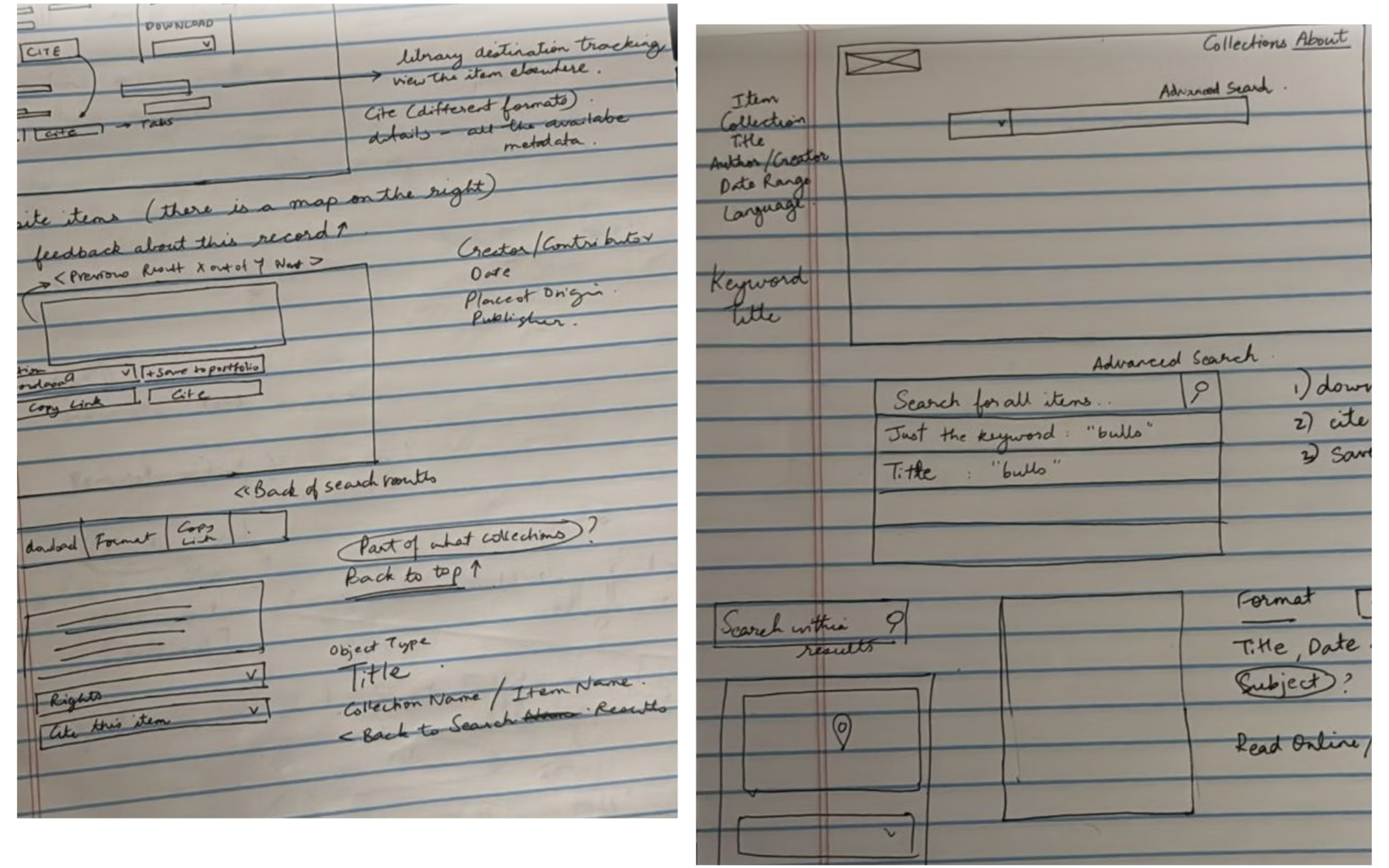
4. rapid prototyping.
I moved quickly from sketches to mid-fi prototypes, sharing progress often with the Node team and Library UX folks. Regular feedback and brainstorm sessions with my manager helped (quickly) shape the designs along the way.
4. usability testing.
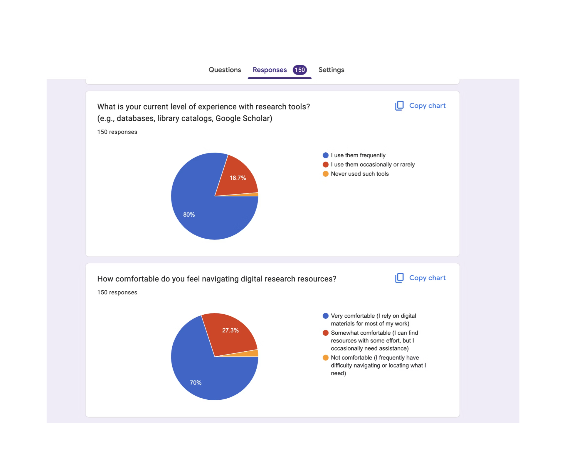
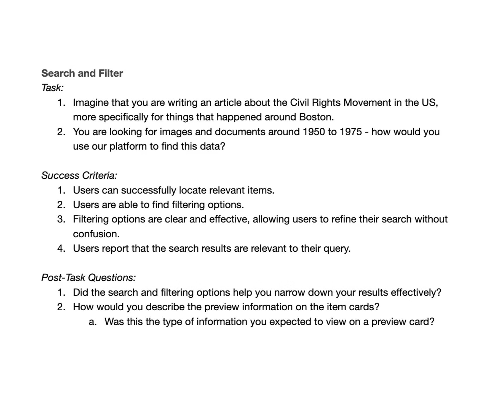
I ran usability tests early in the process to catch design issues before build. I shared a screener via university channels, library networks, and online communities—got ~150 responses. Tested with 8+ novice and expert users across 3 core tasks, each with clear success criteria and follow-up questions. Due to age restrictions, I recruited college freshmen/sophomores instead of high-school students.
Insights:
1. filters & map:
old layout:
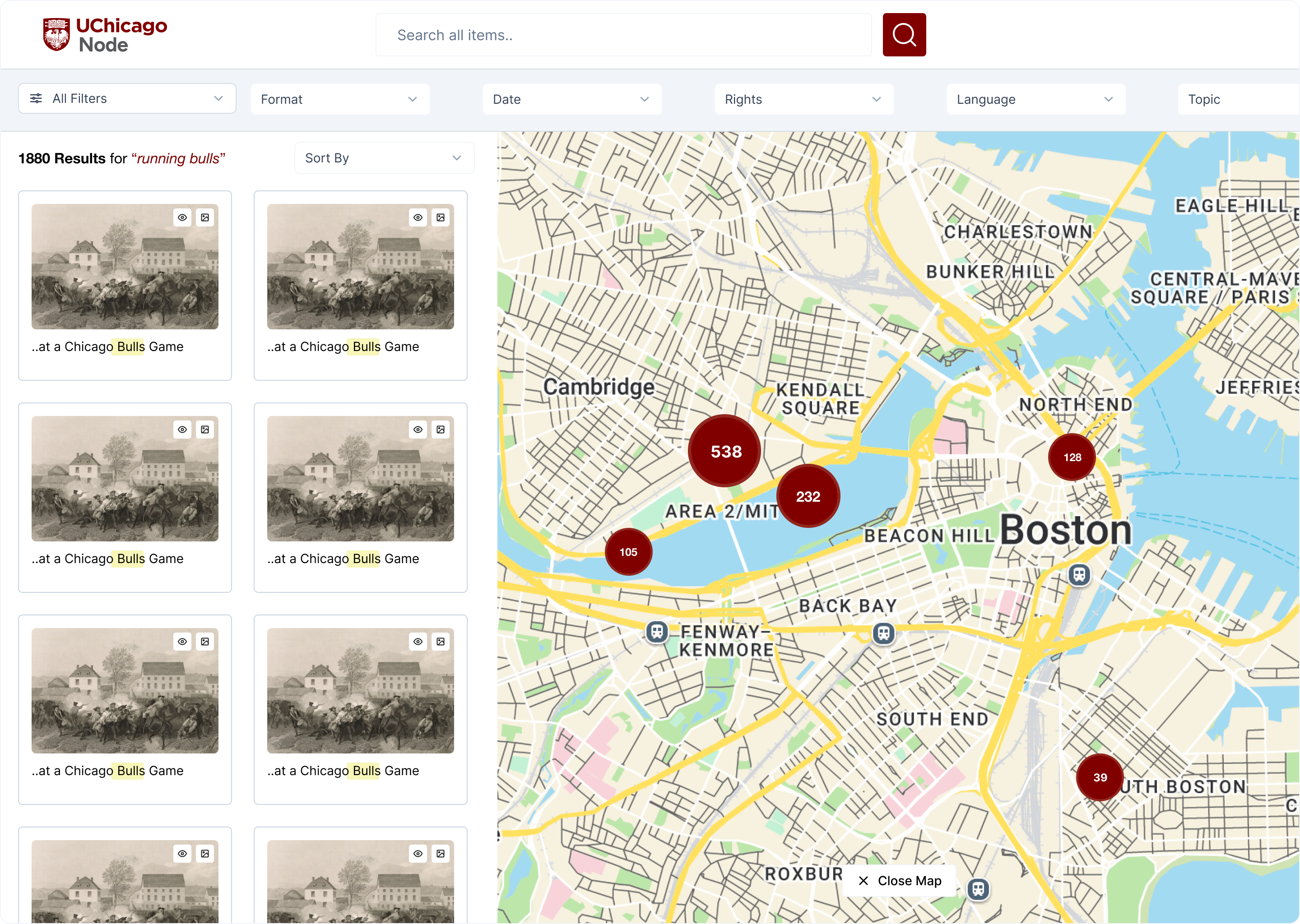
new layout:
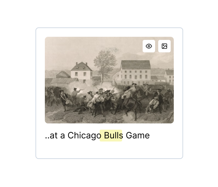
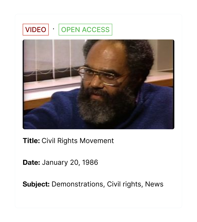
2. preview cards:
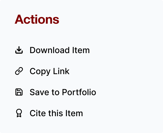
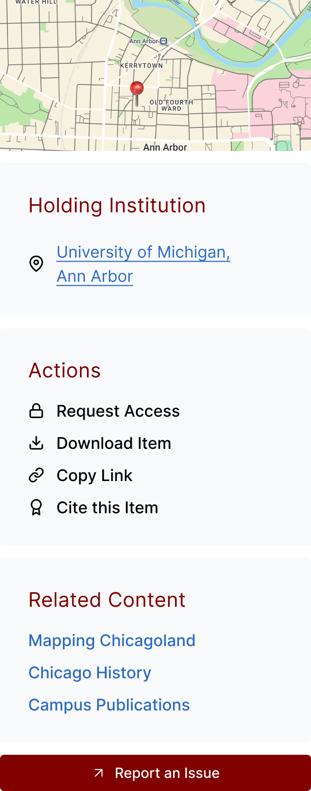
3. actions tab:
- Users typically saved items using document links or Zotero.
- A built-in save feature was suggested but it did not justify the development effort.
- Users valued quick access to details like the owning institution and the ability to report metadata issues.
- A “Request Access” option for restricted items was also seen as an essential action.
- Researchers often navigated collections using a mental map. Surfacing “related content” supported this exploratory way of finding materials.
Outcome:
1. core interface: search and discovery -
This is how the search and discovery interface looks like in its most current version. The visual design is in compliance with UChicago's branding and identity, accessible across all screen sizes.
2. collection page: items and info -
This is a template version of how a individual collections will be displayed. My collaboration with the collection owners made sure that they have autonomy over content, assets and the ability to customize filtering according to most relevant metadata.
3. design system: for scalability -
Created 30+ components and variants combined for consistency across the platform. Keeping the UChicago branding guidelines in mind, documented component states, properties, defined values for font, padding, colors collaboratively with the dev team.
Learnings: