Streamlining the block icon re-design process
A library of 4,000+ icons powers how engineers build with Simulink — but without clear standards, consistency was hard to maintain.
Design at scale shouldn't rely on guesswork.
how do we solve this?
TIMELINE:
Jun 2023 - Aug 2023
TEAM:
Ramya Adusumilli - Product Manager, Arpit Mathur - UX Designer
ROLE:
User Experience Designer
AFFILIATED WITH:
EST. TIME TO READ:
8 mins
Context:
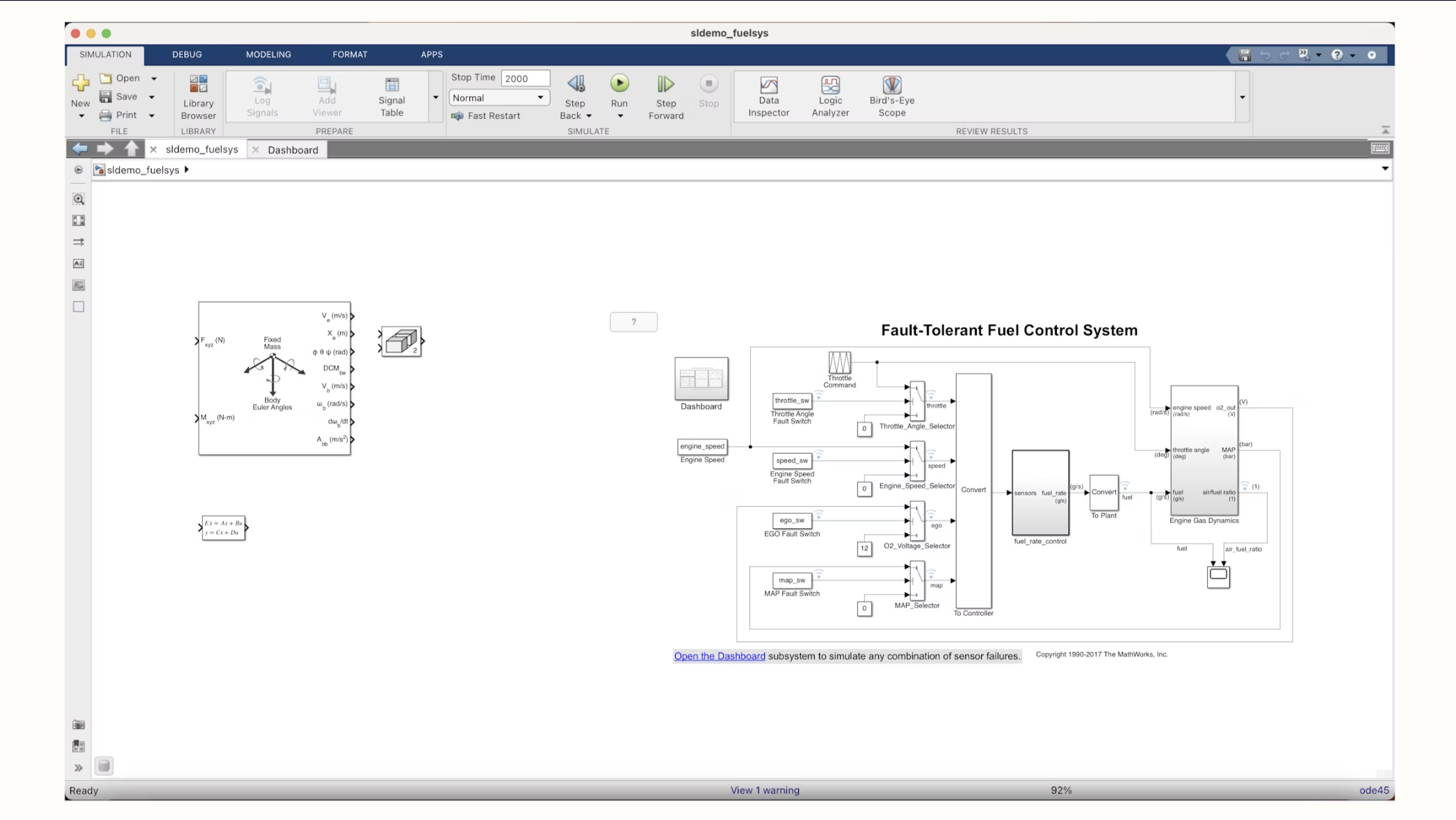
Simulink is a visual tool for designing, simulating, and deploying systems. Think drag-and-drop blocks, customizable libraries, and a canvas built for engineers. Here's a peek at what it looks like in action.
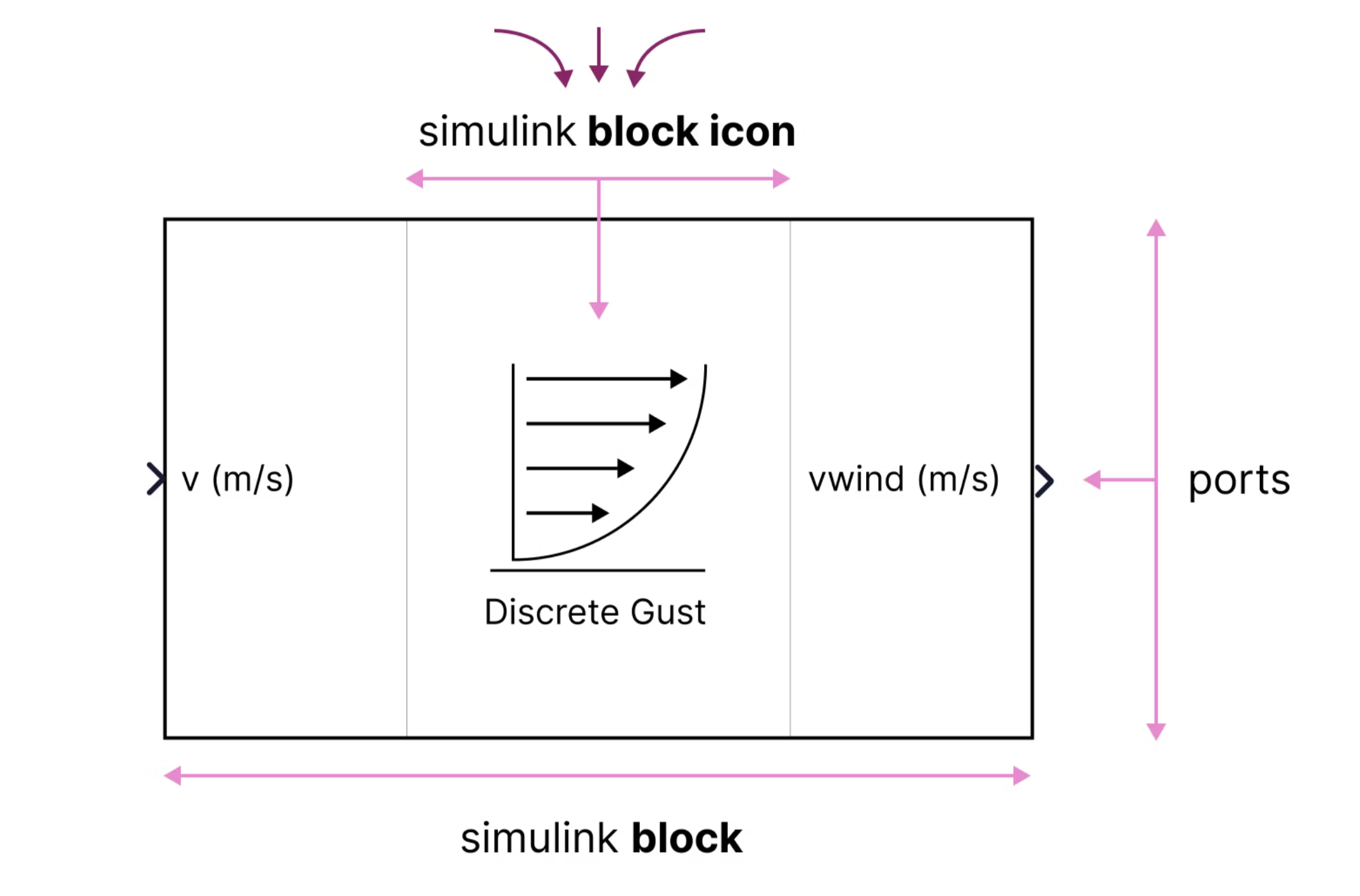
simulink block icon.
Designed in isolation, the icons looked like they came from different worlds.
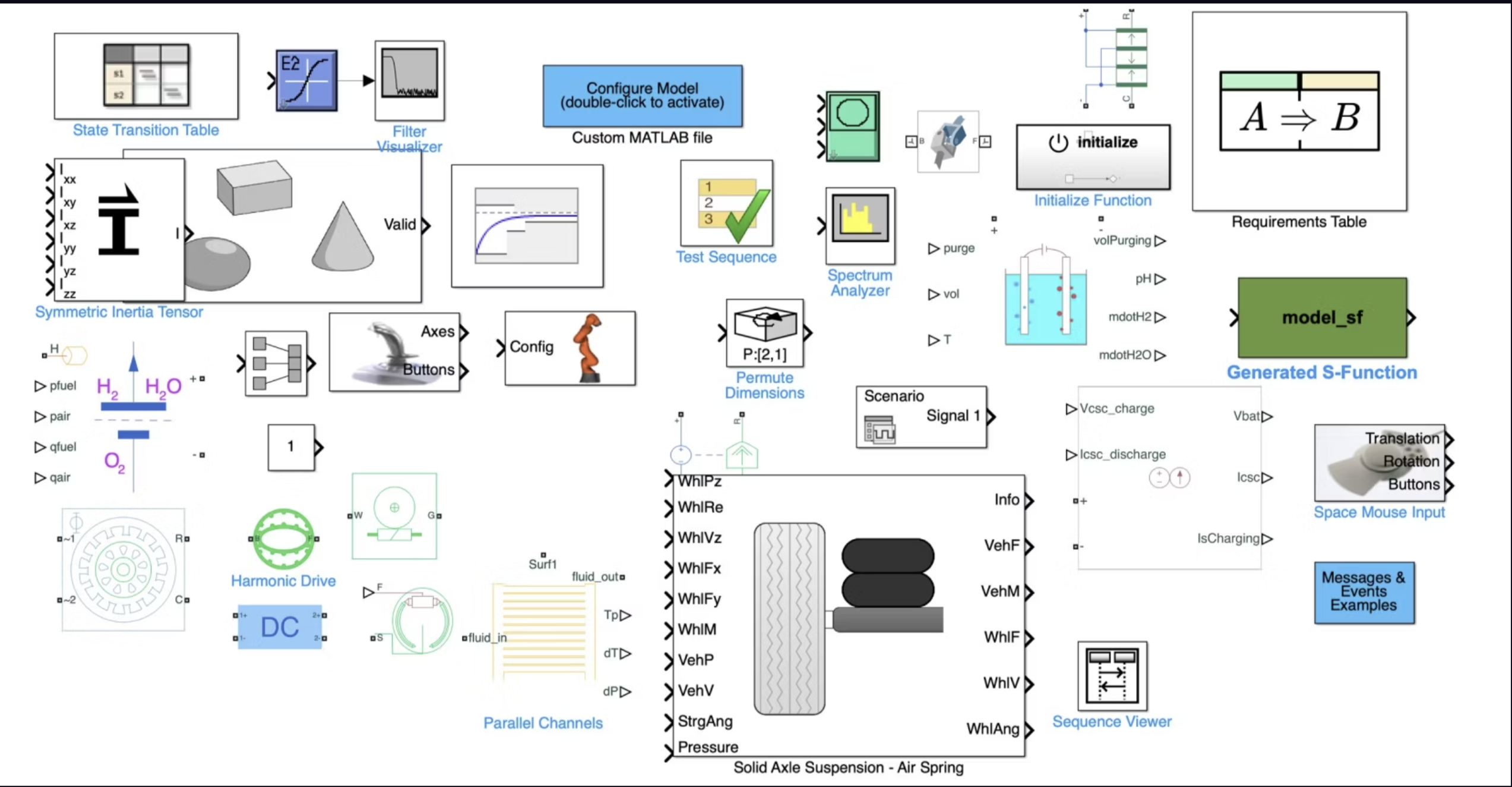
Process:
1. user research.
We were creating this resource for UX Designers at MathWorks.
“No idea what tool to use — Photoshop, Illustrator, Figma? Devs don't know the size or if it should be .svg, .png, or what.”
“I could use an icon I saw in Simulink — it means the same thing. I can't find the icon now, there are too many libraries.”
“What colors, font, stroke should I use? No one has answers — I'm always left without a reference.”
“I want to redesign this — but what are the rules? Do I get creative or just copy what's already in the library?”
2. understanding documentation, icon audit.
we were dealing with 4000+ icons!
To better serve my audience, I went through the internal design docs — got familiar with the setup, Figma libraries, and the thinking behind past decisions. With such a huge icon set, I started auditing — looking for patterns and identified four main block icon styles. I also set up chats with dev teams across libraries to understand specific library icons.
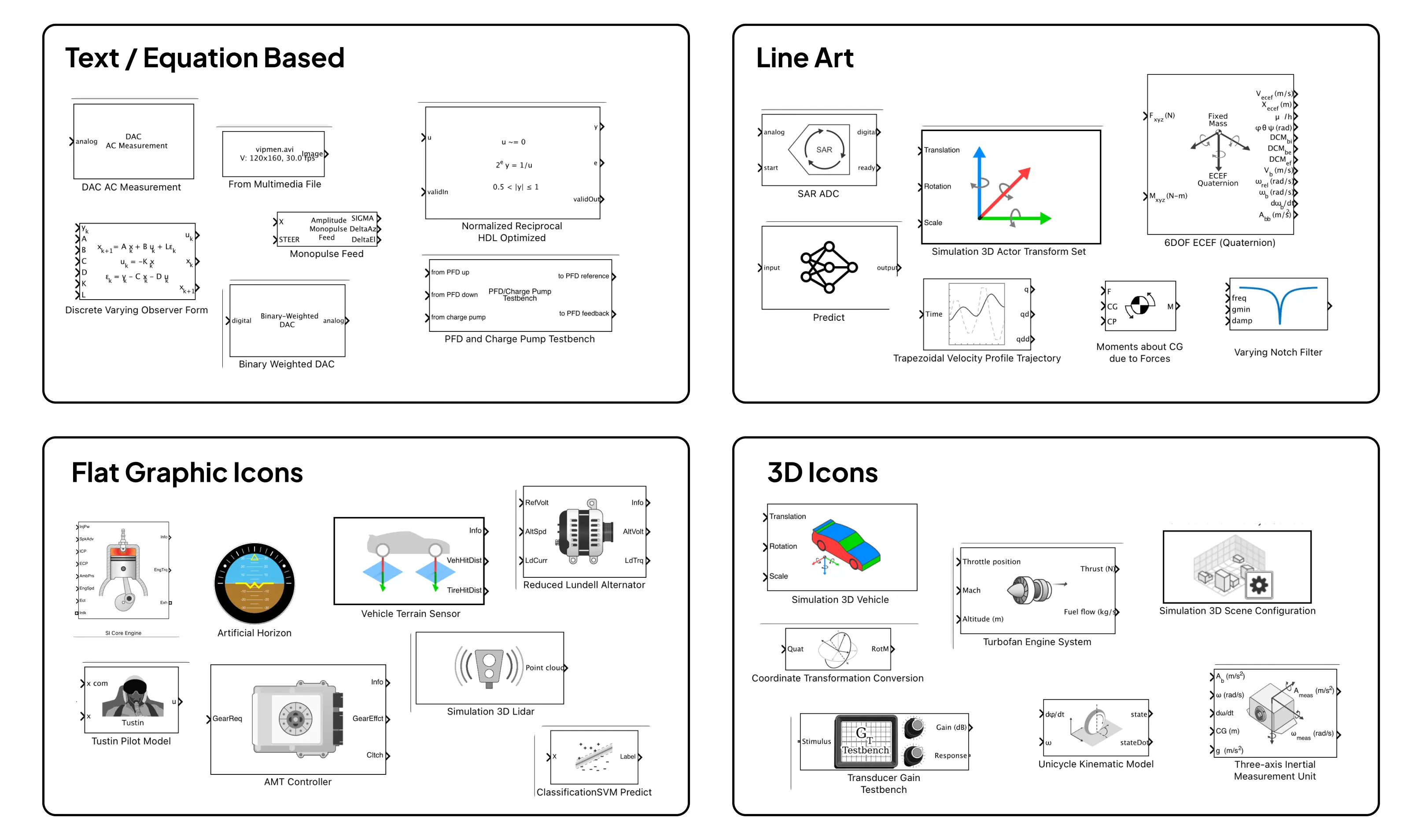
3. draft - test - iterate.
Build fast, get feedback early. I kicked things off with a rough strawman proposal, tested it by redesigning a few icons, spotted gaps, and iterated. Throughout, I kept a steady feedback loop going—with my manager, design system leads, and the UXD on my team.
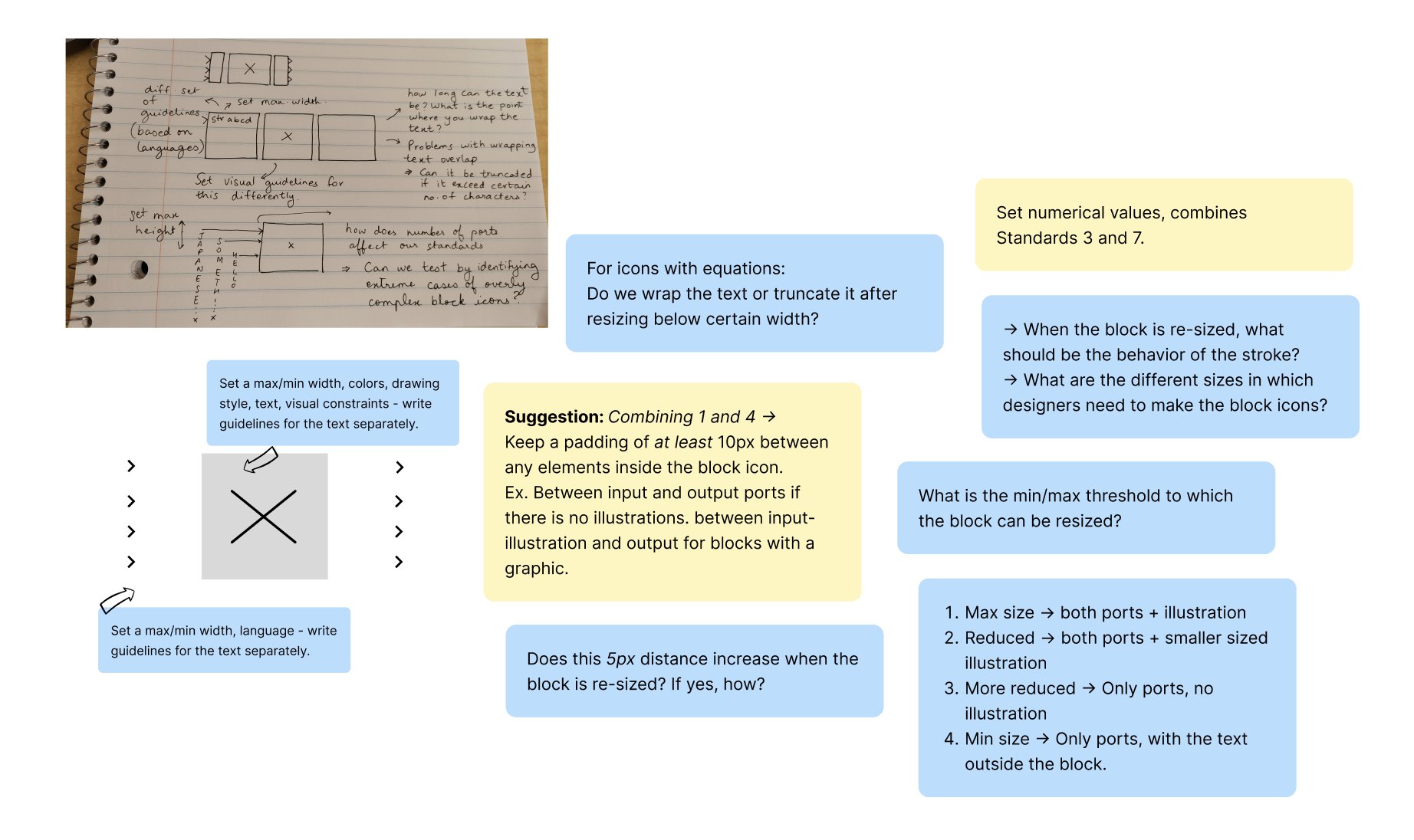
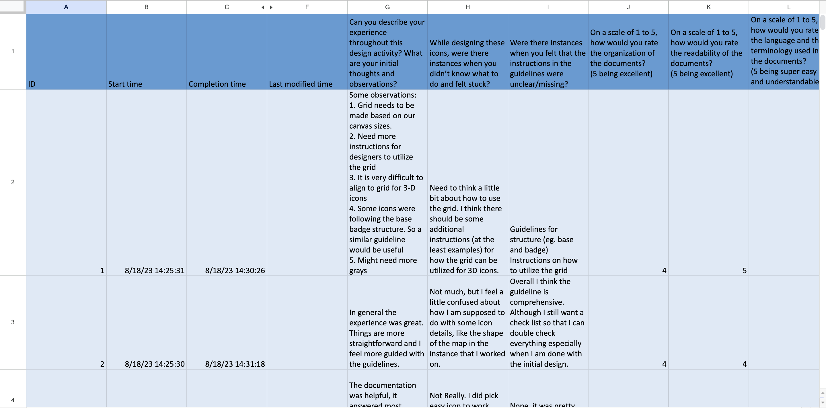
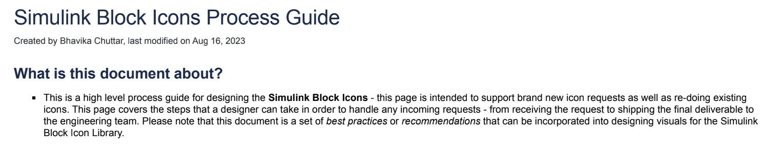
4. design workshop [user testing].
I organized a hands-on testing session with 5 designers from the UX team—our target users. They were tasked with creating icons using the preliminary draft of re-design guidelines. Observing their approach and gathering feedback helped me spot gaps in clarity and usability of the document.
Outcome:
NDA: It is not possible for me to divulge complete details here — please reach out to know all the details!
1. process protocol:
A rulebook for: what steps to follow after receiving a re-design request?
- Step-by-step flow for updating or requesting Simulink block icons.
- Key questions designers should ask devs (behavior, context, visuals).
- Figma setup: which color palettes, grids, and naming conventions to use.
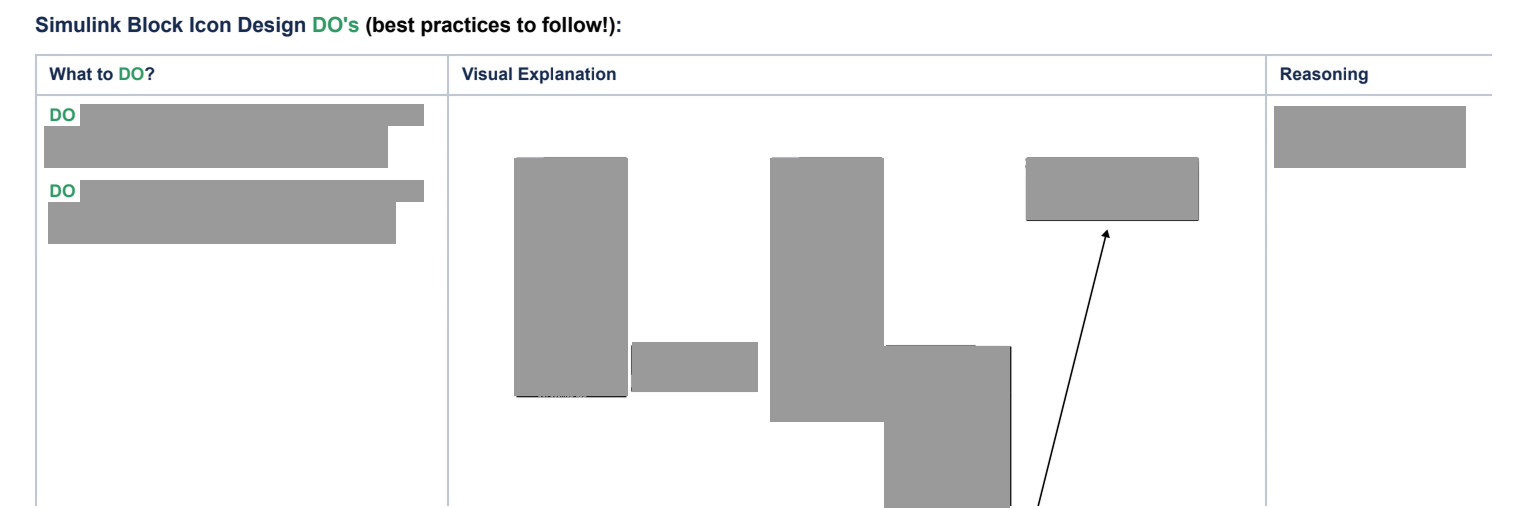
2. re-design guideline:
- Guidelines on default dimensions of the icon, standard stroke to be used, padding and space in the icon, description of the visual language, and tone.
- Clear visual examples of DO's and DON'Ts listed down in tabular format.
- Support for 3D icons, color guidelines with accessibility considerations for light and dark mode.
3. central icon repository:
- Proposal for a central repository to avoid the creation of visual duplicates, and encourage reuse of repeated components.
- Icons are available in different formats as needed, developers can search for icon keywords.
- Icons can be referenced in frontend code by using their ID - which is a unique identifier.
Learnings: