Re-designing for Better Access to HealthCare
Healthcare and technology should work together, but often we end up with cluttered, confusing, and difficult to navigate software.
Software should help, not hinder.
how do we solve this?
TIMELINE:
Jan 2022 - May 2022
ROLE:
Experience Designer
AFFILIATED WITH:
EST. TIME TO READ:
10 mins
Context:
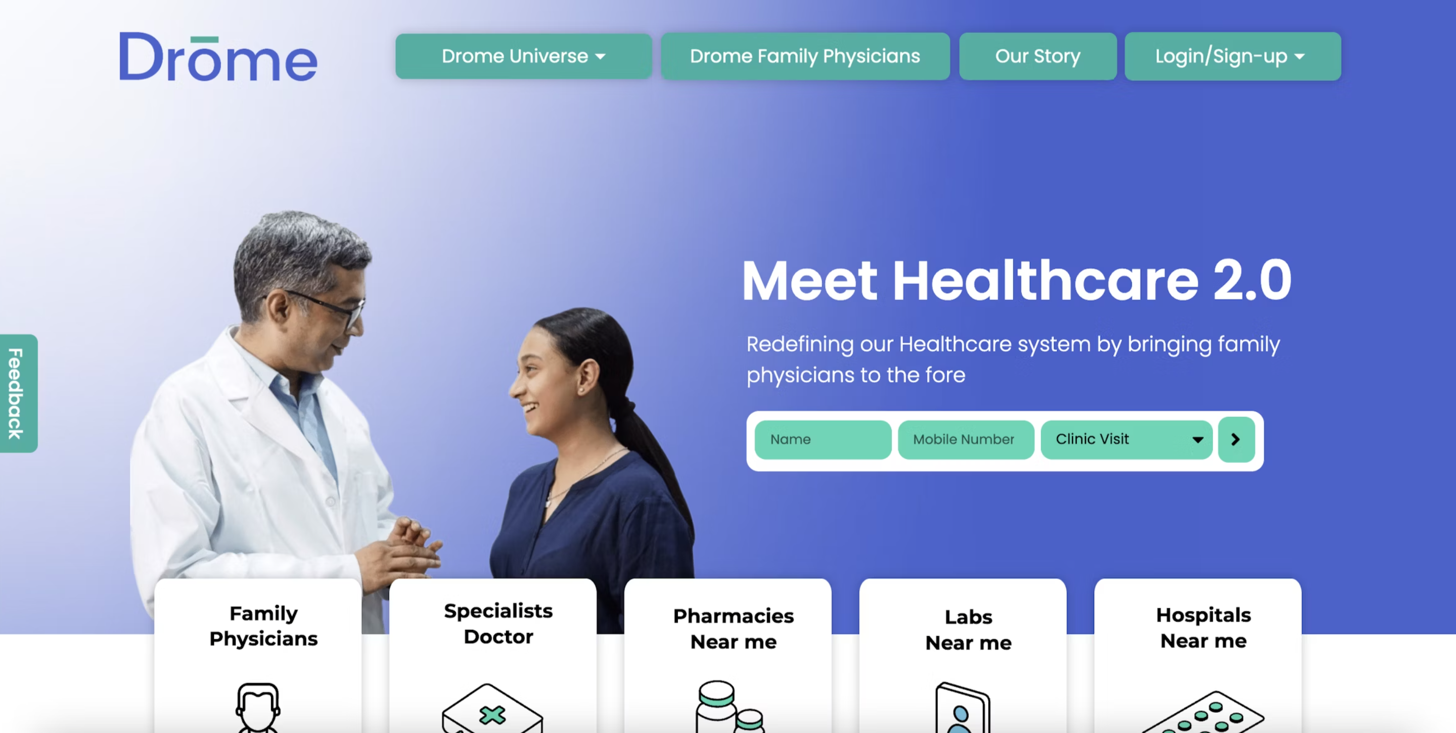
Drome is a healthcare software that connects patients to nearby doctors.
for patients:
- Book appointments with specialists.
- Track personal and family-related healthcare info.
for doctors:
- Record and review patient information.
- Schedule and manage appointments.
what was the problem?
Process:
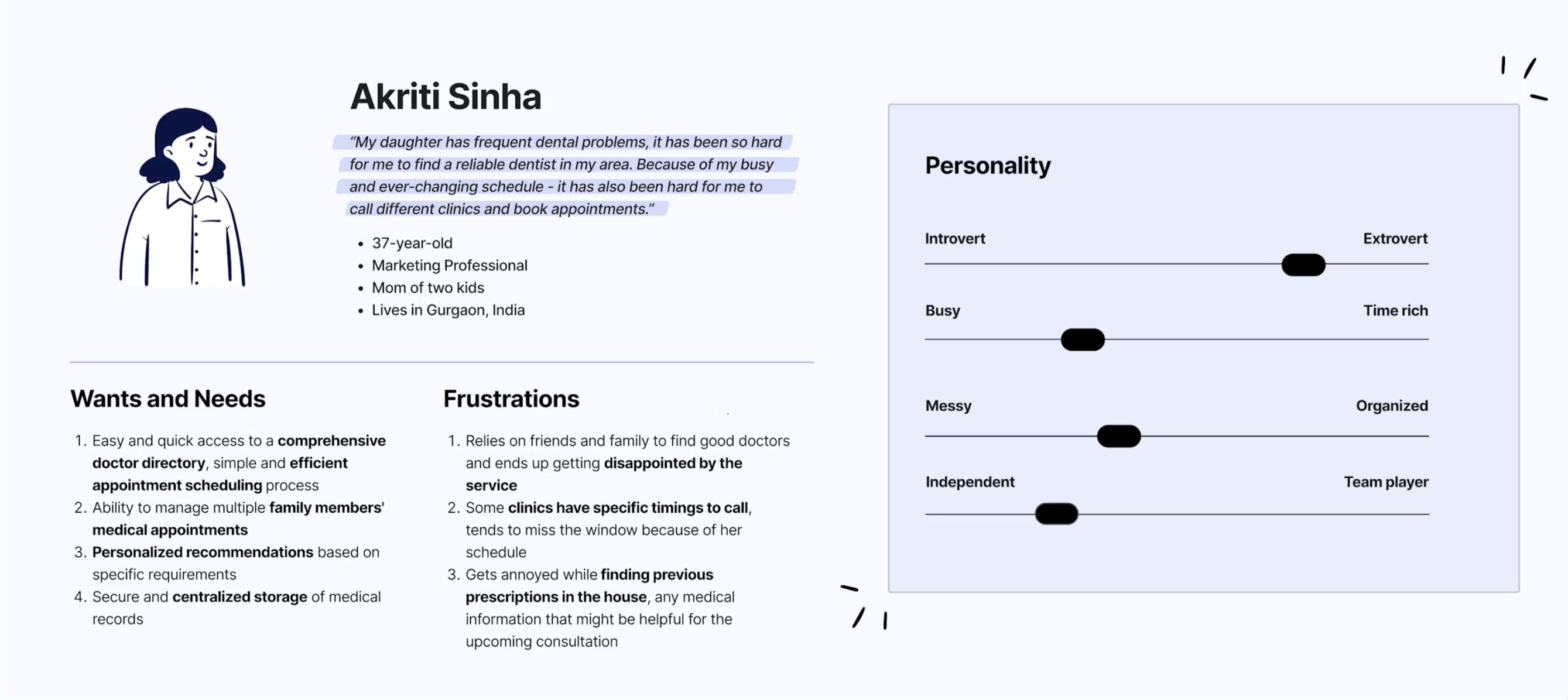
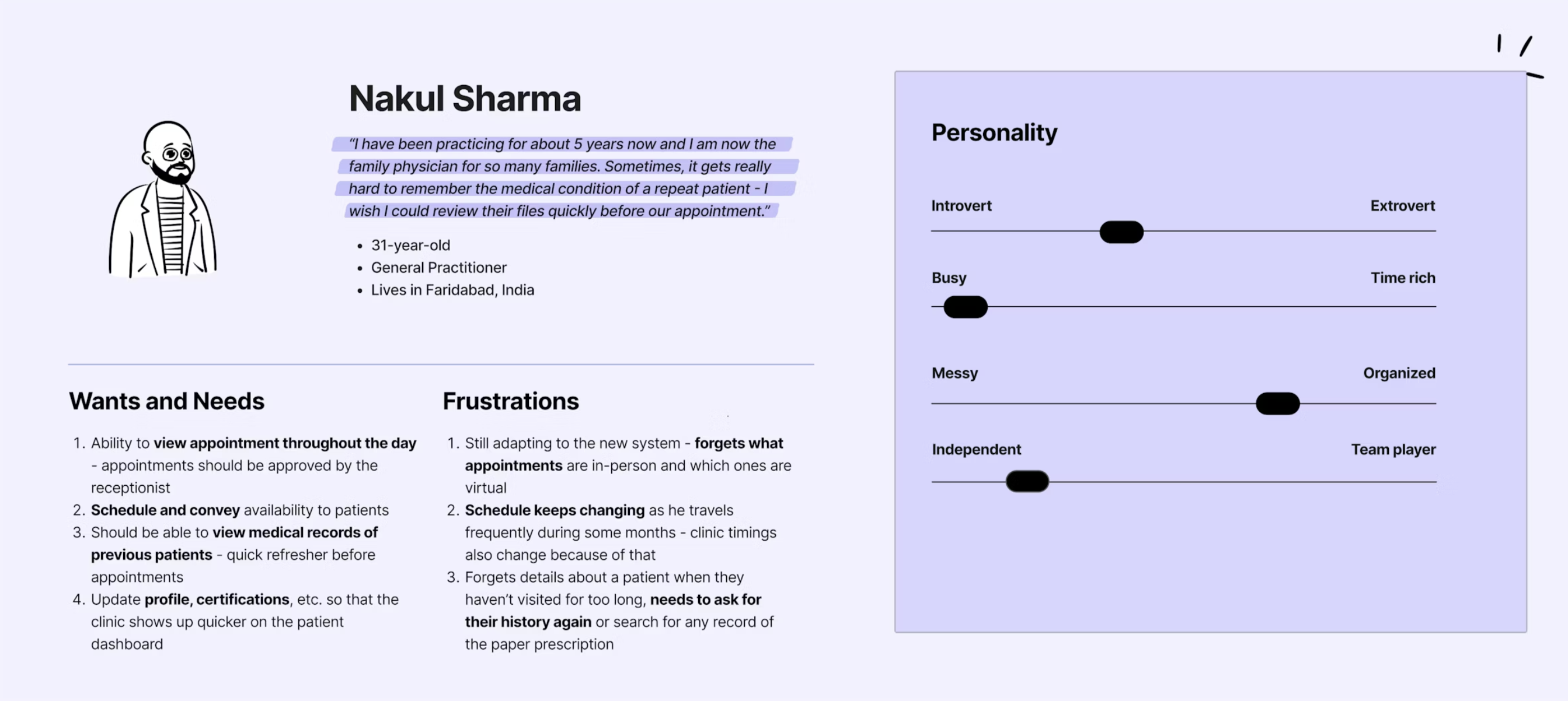
1. user research, persona creation.
Due to the short turnaround time, we relied on secondary research and knowledge gained from stakeholder interviews to understand the needs of our end users.
2. heuristic analysis.
We ran a heuristic analysis against ten key benchmarks, digging deep into how the site actually feels to use. Along the way, we spotted patterns — missing cues, clunky flows, and moments where users were left without a clear next step.
what did we find?
3. information architecture.
Our heuristic review made it clear: the problem wasn't just how things looked — it was how they were organized. To fix it, we focused on building a lighter, faster, more intuitive information architecture.
we rebuilt it around three core ideas:
4. wireframing.
We kicked things off with Crazy 8's — rapid sketches, quick pitches, and picking the best ideas from each round. This fast, messy process helped us land on a strong foundation for the final designs. We also ran three informal user tests early on, which gave us quick feedback, caught issues before they grew bigger, and saved us a ton of rework later.
Outcome:
1. doctor: managing daily appointments -
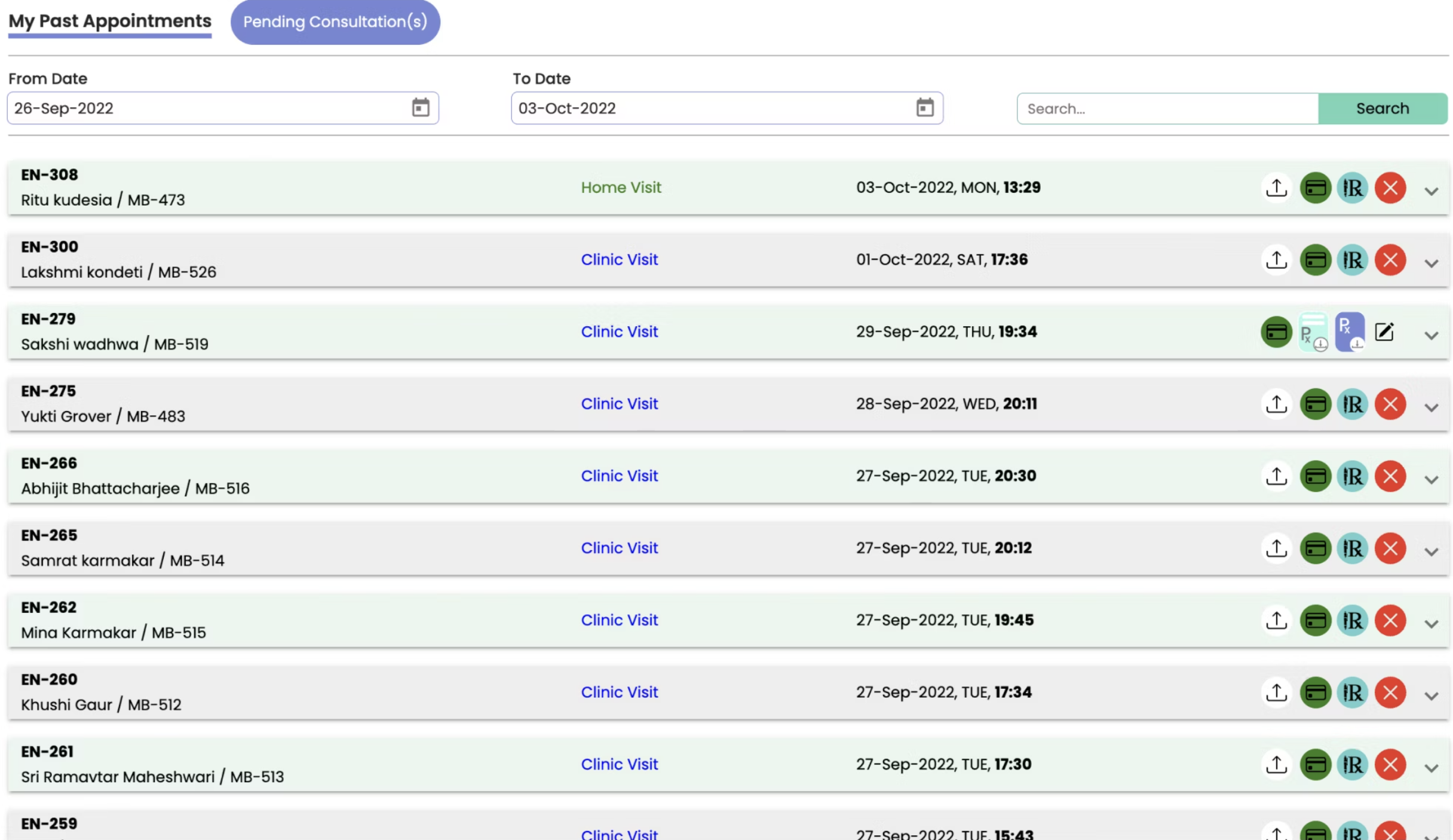
1. Calendar format which makes it easy to view upcoming appointments. 2. Edit appointments and send rescheduled requests to the patient. 3. Can switch between Day, Week, and Month view. 4. Only essential information is displayed, icon actions are more intuitive.
2. doctor: updating availability -
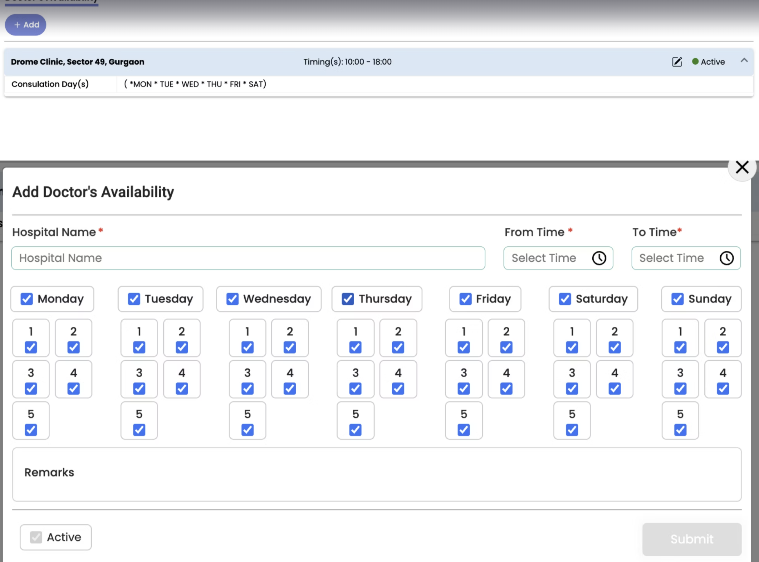
1. Toggle between days of the week you are available or not, add multiple time slots during the day. 2. Add block out days - for days when you are not available for a stretch. 3. Make sure you are in the correct timezone - important for online consulting.
3. patient: finding doctors, scheduling appointments -
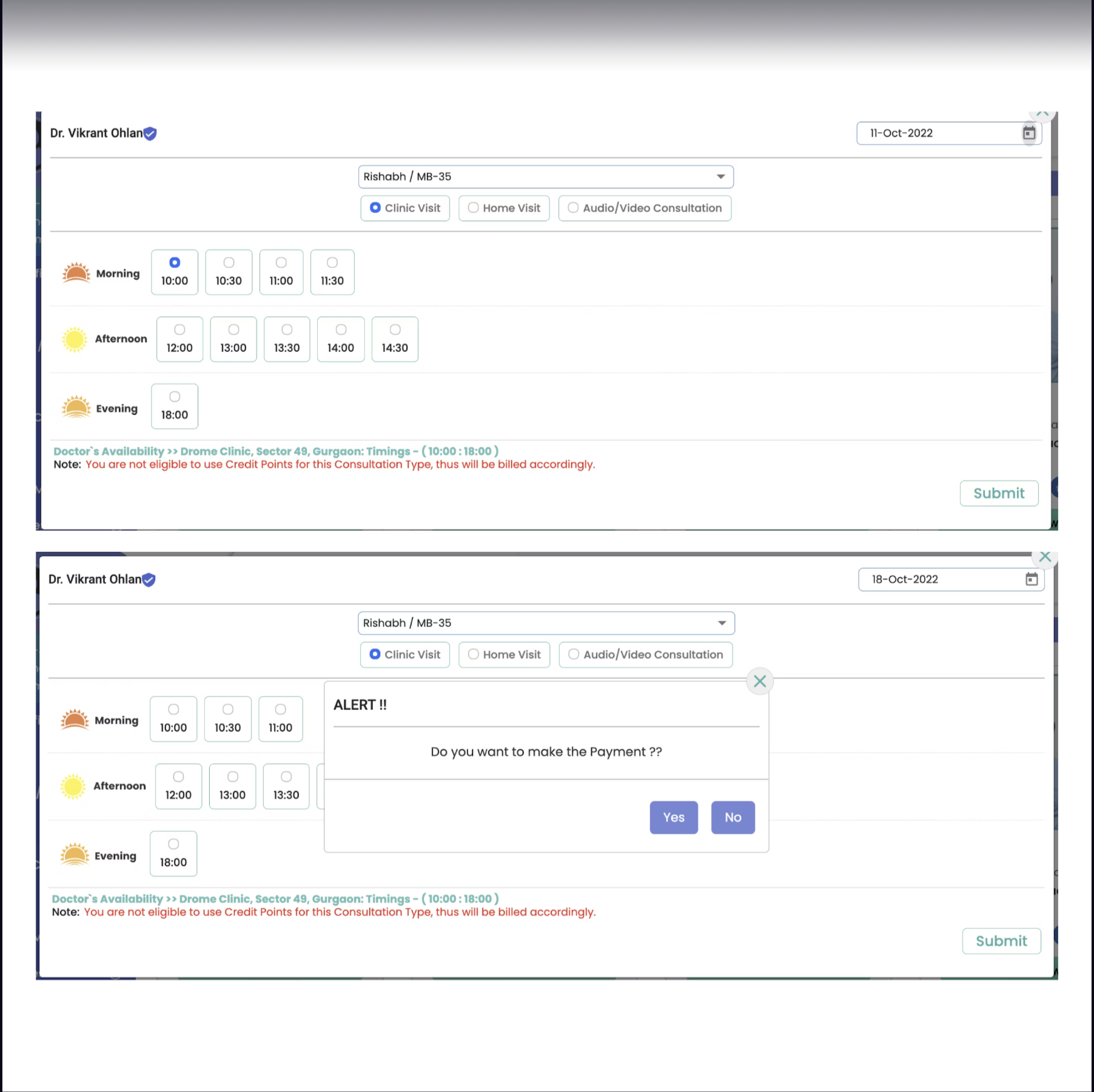
1. Background information about doctors - experience, specialization, charges, etc. 2. Ability to filter accordign to factors like - gender, location, verification, charges, etc. 3. Review, edit, confirm at every step of the process. 4. Error prevention - can cancel an appointment.
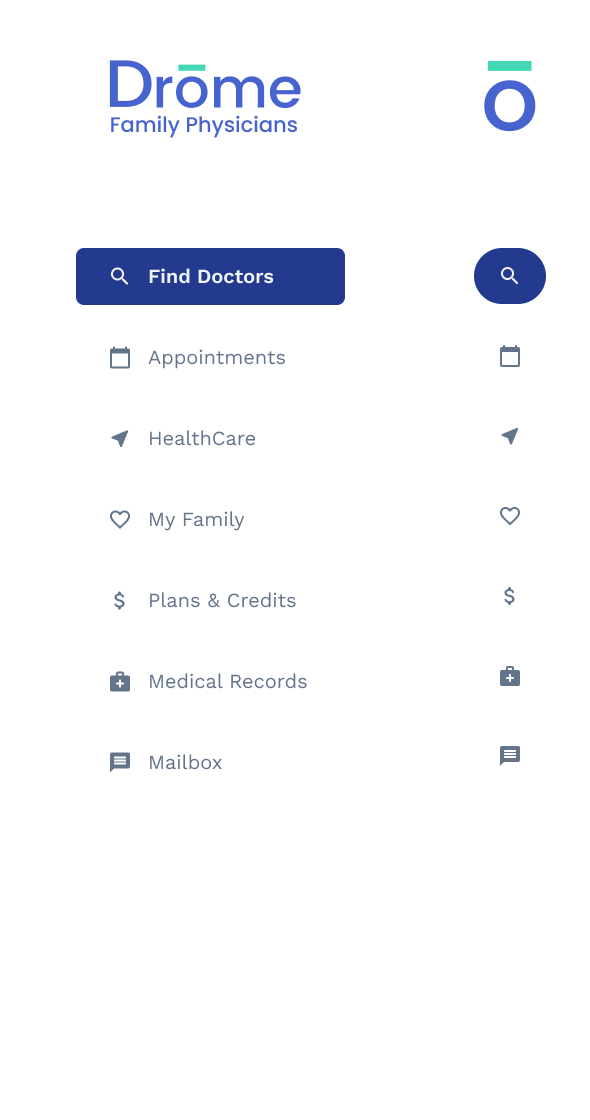
4. patient: navigation bar -
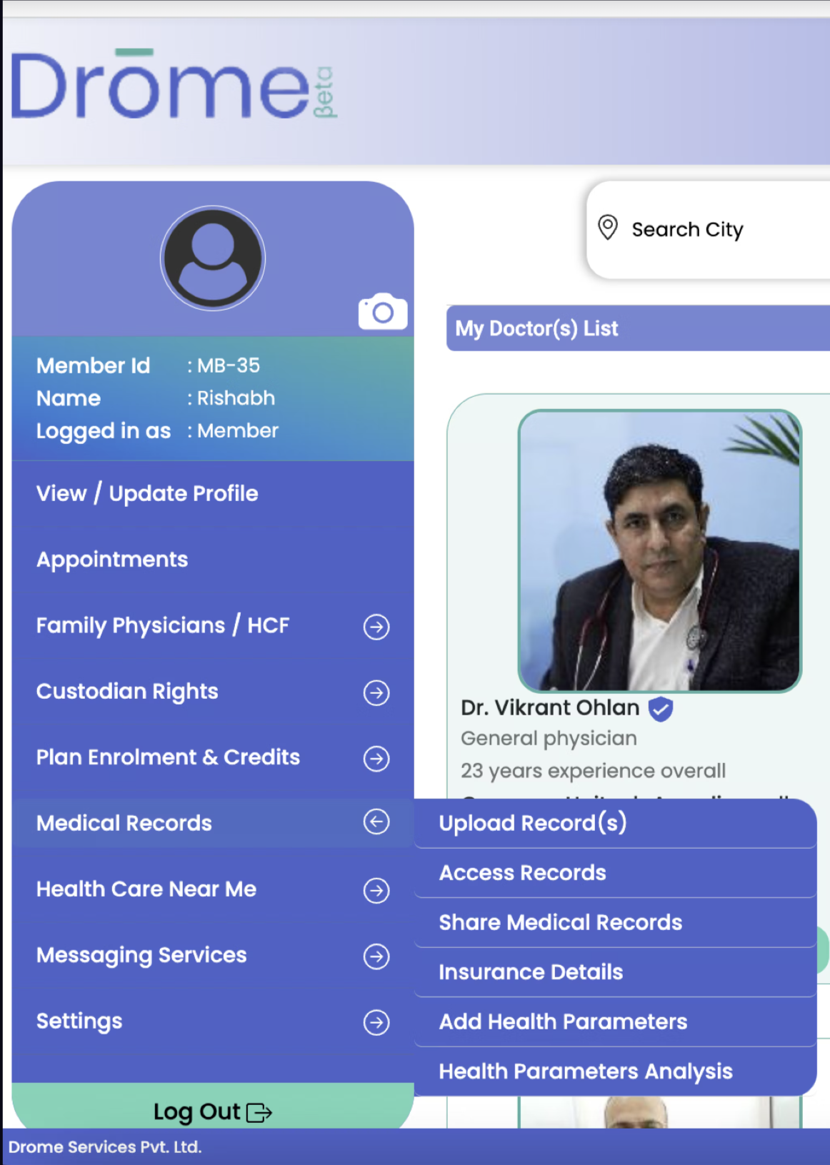
1. Cleaner UI, better UX Copy and intuitive use of icons. 2. Combined repetitive actions, restructured and re-organized. 3. Two views - default and compact.
5. patient: access to medical records -
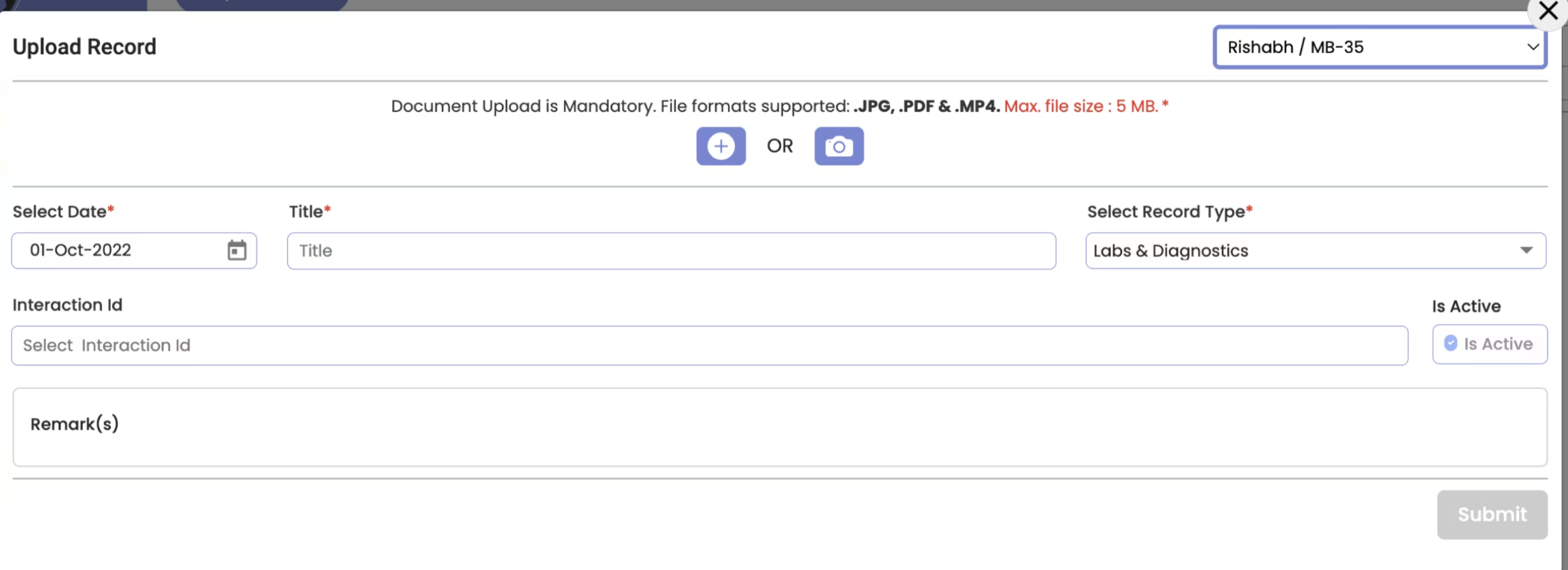
1. Vertical form -- familiar, less cognitive load. 2. Easily switch between records of different family members. 3. Find/sort records from certain periods, can download, share, edit, check status of the record.
Learnings: